• If you were supposed to get an email from the forum but didn't (e.g. to verify your account for registration), email Wes at [email protected] or talk to me on Discord for help. Sometimes the server hits our limit of emails we can send per hour.
  • Get in our Discord chat! Discord.gg/stararmy
  • 📅 April 2024 is YE 46.3 in the RP.

Submission Template Development

Edto Xar'Sivaree

Lizard Freak!
Inactive Member
The points have been made in the Wiki Debate, and I want to work on the middle ground. I have listened to what everyone has to say, and all your points are valid. I will be making sure all the points are implemented into the Wiki as best as I can.

Figured I would make this a thread, though. Watch it if you want. I will provide updates on everything that I am working on and explain what I did, how I did it, in order of my attempts. I will also say what didn't work. I am working in the playground. If you have any helpful comments or suggestions I would love to hear them. The end goal of this project is to have a submission template for every major facet of the Wiki, and have our Wiki look good, professional, provide information in a way that is easily read and understood across the entire board.

Please, if you are going to comment, make the comments assist the project. I would appreciate if those of you with mobile could tell me if any updates I give work on your phone. I am currently working with a prospected 300pixel cap. It's working so far. Following posts will continue what I am working on and how I have attempted to solve issues.

 
Faction Mainpage. Meant to minimize visual impact of a faction page, while acting as a portal to all valid information of the Faction page.

  • messed around with the wrap function. % forces size, as do Pixel numbers, but setting Pixel at 300, avoided breaking mobile. Page looked bad. Needed to correct.
  • Wrapped Right instead of Left. Same functionality, better look than previous attempt, still doesn't break mobile.
  • Used lowest average mobile pixel capability. Has room to spare on my devices.
  • Page so effective, made standard page. This has hopes, accepting comments and concerns. Please offer suggestions.
Care to see? Which revision looks better on mobile? There is no difference on Desktop.
https://wiki.stararmy.com/doku.php?id=wip:faction:vekimen_defensive_task_force
https://wiki.stararmy.com/doku.php?id=wip:faction:vekimen_defensive_task_force&rev=1507823344
 
Modified Black Star Industries. It already used a template that worked with mobile, addition of chart cause issues. Used current chart fix of locking size at 300 pixels. Fix was effective. No scroll lock.

Clearly, I've figured out the majority of the problem regarding charts and tables. Current fix has been 100% effective so far in stopping mobile breaking. My phone even has room to spare. Going to work on an actual template. This felt like cheating honestly.
 
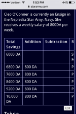
Checking out the character sheet of Cleo O'Conner. To make the page uniform with current layout plan, I made the following edits.
  • Wrapped primary chart to the Right instead of no wrap going left and leaving large blank space, forced 300pixel width.
  • Placed picture of Cleo in Kigumi above "Likes" and wrapped left, changed picture from 250pixels to 300.
  • Cleo Profile shot massed up, wrapped right to remove blank space.
  • Strangely, the finance chart from the base layout was the only thing that was broken on mobile. forces wrap left 300 pixels, fixed mobile break.
  • Discovered pictures not in charts are not affected by wrap plugin and do not break while on mobile.
  • Line break to fix caption error under Cleo R63 picture.
Take a look!

https://wiki.stararmy.com/doku.php?id=characters:yamatai:cleo_oconner
 
This time I edited the Cessation Class Light Cruiser.
  • Added Chart, similar to Character sheet chart.
  • To remove fluff from main text body, put performance & Statistics in the chart as well.
  • Used NASA abbreviations of Speed and Charge.
  • Placed .GIF under Compartments
  • Used static Picture in top chart.
Oh man this looks sexy as all hell. UMPH! Proud of this one. Can once again confirm that there is no mobile break, however I can move the whole page around a little? This doesn't affect the ability to cohesively read however, and has nothing to do with the wrap plugin. Probably has to do with the GIF but oh well right? This is to figure out the Wrap and how to make good layouts with it.

https://wiki.stararmy.com/doku.php?id=corp:black_star_industries:cessation_class_light_cruiser

Check it out. So hawt, no breaks.
 
@Wes do we keep track of fiances anymore? Can it be made optional given you generally ask the GM of the plot your character is in for stuff and things?
 
@FrostJaeger FYI tables like that are not broken, you just have to use your finger to scroll them horizontally because of their size. That is the intentional and expected behavior.

@Edto Xar'Sivaree Finances are already an optional section.
 
FYI tables like that are not broken, you just have to use your finger to scroll them horizontally because of their size. That is the intentional and expected behavior.

Tables as such are NOT mobile breaks I need to be concerned about then?
 
If it makes sense to use a table to list data (example: pay chart), use a table. But don't use a table for page layout (bad example: current page for Taii rank). Also we know large tables will need scrolling so we should use them sparingly.
 
If it makes sense to use a table to list data (example: pay chart), use a table. But don't use a table for page layout (bad example: current page for Taii rank). Also we know large tables will need scrolling so we should use them sparingly.

Would love if you checked out some of the work I have done so far. Other than that tablechart, I have had 0 breaks in the Mobile, and I think the pages grab your attention very quickly on desktop which is wonderful. Would love likes and dislikes.
 
I thinkthis has merit, though I have a hard time imagining the long table right by the table of content isn't causing issues for mobile. It's a dense first pageful worth of stuff.

Also, I think the implementation of the DRv3 stuff sucks, but I keep saying how it ought to be and no one listens to me. >_<
 
Last edited:
If an article is long enough to warrant the inclusion of a ToC (which the above examples do), I feel that it should have any infoboxes above the ToC aligned to the left rather than the right.
 
long table right by the table of content isn't causing issues for mobile. I

So far it is not causing issues for mobile, or no one has provided me proof of it. At this point both our hardcore mobile users have posted without finding a break. They work on mobile. I need pictures otherwise as well as phone specs to solve problems. This is something I need the cooperation it as many people as possible to fix.
Can a table of content be moved, or made collapsible

On mobile, at least for me, the ToC is already collapsed. When we had inline ToC we could have placed the ToC anywhere we wanted but that was removed. I completely agree, and that wiki page you posted is exactly what I am trying to emulate right now. So being able to move and collapse the TOC would allow me to keep things condensed, simple, and still readily accessible.

Secondly, the amount of space given to the side bar is massive. If it was lessened to give more room to say, the information on the page, things would start to look even better. You'd be surprised what a centimeter would do.
I feel that it should have any infoboxes above the ToC aligned to the left rather than the right

This leaves a very large space between the ToC and the chart. A large space that would be much better suited to being taken up by writing instead of being a dead space.
 
Last edited:
So after a brief but informative conversation with @Wes on discord, I have some comments to make about some of these. Specifically the Character page.

So it was mentioned there might be a problem with the character sheet and how the chart is on the left. This is because the ToC varies in size. I don't know how Wes feels, the conversation didn't go that far, but I personally believe that the use of space is better with the chart on the right.

Why though?

Because when you think about it, a chart on the left cant have anything beside it. At least, not at the top of the screen. This leaves a VERY large blank space between the Chart and the ToC. When the Chart is on the right, if the ToC is shorter than the chart, then there will be a space under the ToC, between the chart and the practical border of the text zone.

The space between the chart and the text zone will always be there, and is far less intrusive and encumbering than the massive space between the ToC and the Chart. This also allows a user to start reading the information on the page immediately, instead of having to scroll down to see it all. Either alignment will have a blank space, but that blank space is less with the chart on the right, than with the chart on the left.

There are other solutions to this, however. Moving the ToC to the Left side of the screen. I don't know if that can be done though. Second would require two pligins. INLINEToC, and a plug in that allows you to collapse the ToC. This way, we could up the ToC on the page in a format similar to how Wikipedia does it. I know that will /work/ but I don't know if it will work on Mobile.

@Wes. Would you be willing to download this so I could use it to further improve my designs?
 
With the requested plug-in unadded, probably due to time constraints, and no other complaints made, I feel these are ready for re submission for the submission Templates.

@Wes, the code used to generate the character sheets. Could you please link me to something explaining how that is done, so that I could made one to build technology? I feel that would greatly ease the process of transitioning to assuring all content follows the fixed templates.
 
RPG-D RPGfix
Back
Top