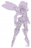
Re: Osaka's doodles... And maybe comissions.
Update
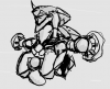
Been experimenting with some layer affects.
 Click thumbnail for larger view
This is mostly for my own benefit but might be worth looking at if you want to try yourself. It works very well for metal... With some careful work, it might even work for skin.
Update: "Mysterious ways"
Got my technique all sorted, having a wonderful time.The moment I save,
Photoshop dies, taking my machine with it and then all the lights in my house flicker.
Just swapped 4 bulbs: We had a power-surge.
Thankfully, my surge-protector worked but I lost 2 hours of tweaking and fiddling about: Turns out my details missed out a lot of really subtle stuff (mostly in terms of opacity/fill levels that make my technique work).
I fiddled around and I think I found an improvement I otherwise might not have that allows me to "paint" one face, then use a hard brush in black to create black gently against the gradient then leak in with the
DODGE TOOL, NOT THE BURN TOOL to get this really nice smooth affect, like the kind of thing you get in car concept art
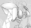
Updated Layer listing reference in their stacked order
Lineart - [NORMAL]- 50% Opacity
Usage: Take normal sketch on transparent background (new layer required at start - a good habit) and invert color (APPLE/CTRL + I) to get a good white against the black. Useful for knowing where things are defined and formed.
Matte - [OVERLAY] - 49% Fill
Usage: Fill with flat colors in areas that apply. A nice even flat coat: don't even think about shade. Double this layer for decals at 75% opacity (Call tis layer "Decals" - Might be ideal for scratched metal effects using clone brush?)
Lighting - [LINEAR BURN] - 23% Opacity
Usage: Start black, dodge in glowing and any glare/bloom. Double up layer on half opacity to intensify the affect and then use burn to darken non-glow areas (Call this layer "Highlights")
Definition - [LIGHTEN] - 72% Opacity
Usage: Start black, dodge in how light falls. Paint in scenery. Happy little accidents seem to happen regularly. ") Observations
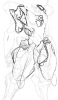
Observations
I can only see what I've defined in the definition layer for color. Everything else is pitch black (as you can see). Not the end of the world but annoying sometimes. Paint the matte first and then feel good knowing you can fuck with that layer (apply texture, image, decals, anything) and it looks pretty good.
If you use a black brush on the Definition layer and clear out a hard-edge face (side of a dice for example) and then dodge it back on one side, a repeated dodge will create a hard face with proper lighting dynamics (See image).