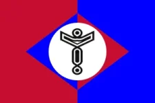
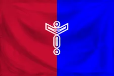
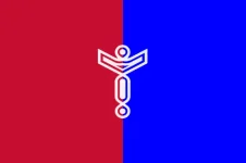
This is the current Neshaten "flag":

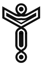
Here's the article that explains the symbology.
There are a number of problems with this flag design, the first of which is that it doesn't appear to be a flag at all. It's not a solid piece of cloth (it's got cutouts in the middle) and it has rounded edges. It looks more like a carving or something. Second, the flag is so dim that it's almost invisible against the starmap or the dark background of the default wiki template. If you saw it from a distance it would look like a blob with a "dark mixed Play-Doh" color.
Here's the 5 basic principles on designing a great flag, according to both Ted Kaye, author of the book, Good Flag, Bad Flag: How to Design a Great Flag, and the North American Vexillological Association:
- Keep it simple, so simple a child can draw it from memory.
- Use meaningful symbolism.
- Use two to three basic colors.
- No lettering or seals of any kind.
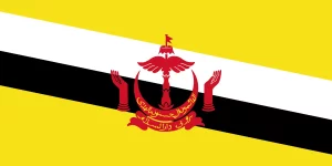
- Be distinctive or be related.
