Star Army

Star ArmyⓇ is a landmark of forum roleplaying. Opened in 2002, Star Army is like an internet clubhouse for people who love roleplaying, art, and worldbuilding. Anyone 18 or older may join for free. New members are welcome! Use the "Register" button below.

Note: This is a play-by-post RPG site. If you're looking for the tabletop miniatures wargame "5150: Star Army" instead, see Two Hour Wargames.

  • If you were supposed to get an email from the forum but didn't (e.g. to verify your account for registration), email Wes at [email protected] or talk to me on Discord for help. Sometimes the server hits our limit of emails we can send per hour.
  • Get in our Discord chat! Discord.gg/stararmy
  • 📅 October and November 2024 are YE 46.8 in the RP.

Community Meeting

In Discord Voice 1
In Discord Voice 1

Star Army New Map

Arieg

DEFCON Everybody Dies
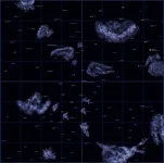
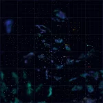
This was something I was working on some weeks ago then I got distracted and put it on the wayside, overall its intended as a new site setting map. The main feature is that the front page map has as few details as possible, removing most of the clutter I found that plagues the present one, instead its a color based star map showing SARP's factional holdings divided up into sectors. Each one of these sectors becomes its own detail map with all of the fine text and numbers of the original in a less cluttered form.

Main map
ai.imgur.com_3xtJ7oC.webp

Sector Map
ai.imgur.com_jDkRNTe.webp

The question is.. would you guys like me to proceed with it and if so.. what would you like see changed or added to the present formula?

 
Sorry Arieg. I know pertinently how much work you've put into this... but at this point despite your effort and it being graphically superior, I kind of find it harder to consult than the original.

There's something about the font and the cleanliness between systems that bothers me, as if there was something missing. I'm not too fond of the way you've drawn your nebulas - they kind of look wrong to me... Wes' were more simplisticly abstract, whereas yours are more detailed on the closer view, but perhaps in the wrong direction (less is more? they look fine on the first map). There's also something about scale and distance which is much harder to grasp than Wes' original work.

It's also a bit too color-based, which makes it harder for someone who's colorblind like me to pick up territorial boundaries. Maybe what I find it's missing are the concentric rings denoting 'light years from Yamatai' as well as flags on each stars along with the periphery of territories being more clearly defined by a contour. There's also how I'm uncertain that it's a good plan to make a consultation a 2-step process, when with the original map I could pick up things from a glance.
 
Fred has a point on the issue with colorblindness and this map. Anyone who is colorblind will have an issue reading the map.

However, I honestly don't seen anything wrong other than that. To fix the distance / scaling, Arieg only has to add a scale ruler or something similar to the map. The Nebula look much closer to proper nebulae, which is something I like. I'm also a big fan of the flags going away, but again --- colorblindness issue. I also dig the second map that it can show the fact that some systems have multiple stars (ie Sesestra), though Schongebiet is a binary star system (though I should mention that).

Over all, it's a great map that just needs some tweaking.
 
Not a fan of this map in its current incarnation. One of the is the same as what we have with the current big map, and that I liked about the Clustered map concept. I like the idea of being able to update the areas that I am responsible for without having to ask someone else to update the image.

The other issue I have is that a significant amount of space is missing from this map and at its current scale one can't determine anything.
 
Hmm I re-shift my stance, I like the cluster map format more too because we can adjust as necessary. It frees up more space, and makes space large like it really is
 
I'd like to specify that Arieg's map has aesthetic strong points. Not to mention that it's presently the only map I have access to (save puzzle pieces of the cluster map found on the wiki) so I'm grateful for any map at all.

But, Arieg repeatedly came to me before in IRC showing his progress with this, so, I just want to reiterate that I mean everything I've said constructively. To me, this is still a work in progress which still has tons of potential. After all, the person whom pushed the clustered map idea is no longer really pursuing that progress, and since then we've... made no progress in this regard.

Arieg, take the comments above as an indication of where community interests seem to lie with said maps. I'm hopeful that you'll persevere. I know where you started out, and know how much progress you've made since.
 
I'd like to specify that Arieg's map has aesthetic strong points. Not to mention that it's presently the only map I have access to (save puzzle pieces of the cluster map found on the wiki) so I'm grateful for any map at all.
You can't see the main map here?

I suppose I should comment on it. Here's the stuff I like:
  1. Placement of systems is accurate to SARP history, current map
  2. Square grid makes the map easy to break down into smaller more detailed sections
  3. Glow effect is less cluttered than the flagpole markers
Here's what I think could use improvements:
  1. Nebulae appearance (I'm willing to try helping with these)
  2. You can't tell what star system is what because they're not labeled on the big map
  3. Needs more scale markers
Most importantly, is this map made in layers so it's easily edited?

Re: Cluster Map. The cluster idea was (mostly) trashed a couple years back. We're not going to break up the main map, although clusters can be used for off-the-map areas. I am not opposed to us using actual sectors in a similar way, though.
 
Last edited:
You can't see the main map here?

Ah, there it is.

I found I had no way to actually access it by clicking my way around the forum/wiki or doing wiki searches. I'd count better accessibility as a definite plus.

* * *

Personally, I like the nebulae on the bigger non-zoomed map. The ones on the zoomed in map, I'm not as fond of.

Also, I've said this before to Arieg, but I think the subtle diamond gridding all over the map might look better as square gridding. It's... the kind of thing I'd expect more on stellar cartography instrumentation myself (squares can be interpreted as scale/carthesian coordinate markers, Diamonds though... not really).
 
Last edited:
@Fred: I'm pretty sure it's linked from the front page of the wiki under the setting section.
 
Ah ha! I was using the search engine and looking for "star map", not "space map". And yeah, there's a link down there in geography. I don't usually scroll down. Thanks!
 
I am not opposed to us using actual sectors in a similar way, though.

Kindly care to clarify by what you mean by sectors, and how those would differ from the clusters that we used for many of them like the KMS which used to be the KMZ.
 
I mean the squares of the map could be used to break the map into smaller sections with more detail like Arieg did.
 
Well I spoke to Arieg, and if the big map were displayed larger like the current one and we added the planet names that would be a step in the right direction. If we are talking about the smaller sections be maintained by people who are responsible for the systems there. Then I like that idea. I really hate having to go to someone else to make updates.
 
To be honest, Arieg's map could be used for something like Google Maps (the source code DOES exist, and there are programs out there that can work on a website) which would make updating the map even easier (at least in terms of adding systems and such, increasing borders.... I dunno if that would be possible) The only thing is that we'd have to restrict access to edits by only allowing actual wiki-members to do it.
 
As I already said to Arieg in IRC. If the main map is not going to have significant points identified with their names, then I do not endorse this.
 
RPG-D RPGfix
Back
Top