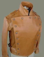
I'm not sure where I'll put the rank (I think at least the enlisted should have patches on the arm in the manner of the black coat). The color panel goes all the way around like the current uniforms. The current duty uniform has about the same amount of the occupational color so the non-uniformity comment seems strange to me.
Star Army
Star ArmyⓇ is a landmark of forum roleplaying. Opened in 2002, Star Army is like an internet clubhouse for people who love roleplaying, art, and worldbuilding. Anyone 18 or older may join for free. New members are welcome! Use the "Register" button below.
Note: This is a play-by-post RPG site. If you're looking for the tabletop miniatures wargame "5150: Star Army" instead, see Two Hour Wargames.
-
If you were supposed to get an email from the forum but didn't (e.g. to verify your account for registration), email Wes at [email protected] or talk to me on Discord for help. Sometimes the server hits our limit of emails we can send per hour.
-
Get in our Discord chat! Discord.gg/stararmy
You are using an out of date browser. It may not display this or other websites correctly.
You should upgrade or use an alternative browser.
You should upgrade or use an alternative browser.
Uniform Updates for the Star Army of Yamatai
- Thread starter Wes
- Start date
Fred
Retired Staff
To be frank, it doesn't inspire much in me. It makes it look more ground-to-earth than the present designs we have... and that's actually a direction I don't find appealing. What I'd like to see with the Star Army of Yamatai is not more realistic uniforms, but rather uniforms that would look thematically stronger, and futuristic in the sci-fi sense.
I definitely feel that the rank-pin needs a new approach. I'd like to see more visual distinction between officers and enlisted. I think obvious panels are a narrative crutch which I seldom use in narrative imagery.
Seeing traditional japanese come out would be welcome (since 'army japanese' is - plainly - just boring) but even if my current Kotori art leans on that... it goes only halfway.
Unless there's a radical stylistic change that would breathe 'cool' all over while being new and identifiable... I'd save on the commission money and keep what we have right now.
Thanks for your input Fred. This is the "fancy" uniform of the Star Army and because of that I think that it should probably be more traditional (inspired by past Star Army uniforms) than futuristic. However, I do agree with you that some futuristic elements would be good for other more combat-oriented uniforms. But I love the working uniform and don't want to phase it out.
The uniform concept I linked would be a direct replacement to the Type 30 duty uniforms and I would make it part of the service dress uniform (basically this would also take the place of the black coat, too, unless you want to wear the coat over it). This would reduce the uniforms in the Star Army to 1 working (everyday use) and 1 service dress (for office/formal use, with optional black coat), plus the various combat uniforms and suits.
The uniform concept I linked would be a direct replacement to the Type 30 duty uniforms and I would make it part of the service dress uniform (basically this would also take the place of the black coat, too, unless you want to wear the coat over it). This would reduce the uniforms in the Star Army to 1 working (everyday use) and 1 service dress (for office/formal use, with optional black coat), plus the various combat uniforms and suits.
Im gonna say, I like the current type 30 uniform better. The new concept reminds me way to much of Star Trek, like a mix of the red coats from the movies and the TNG era black and colored jumpsuits, just needs the strap over the right shoulder for the ranks. The design is fairly generic, I can find many similar uniforms looking like that any scifi anime series on top of it looking like Star Trek (Macross, Gundam, Irresponsible Captain Taylor, Space Battleshop Yamato, Nadesico, Banner of the Stars, etc, etc). *shruggs* just my 2 cents on that.
One thing I like about the 30 is the obvious difference of materiel between the colored panels and the thick and comfortable looking neck area and sleeves. Its different that what I have seen in other series.
Ive also noticed from taking a look around the info pages for current and past uniforms that they seem to change on almost a yearly basis. That's a lot of turnover of materials and supplies. Most armed forces will hold onto a uniform for a good while. I would think it be better to keep what we have, which is pretty cool, unless something really unique and original comes around.
Aendri
Inactive Member
Personally, I still prefer the 30b. If you're honestly trying to consolidate uniforms, consolidate what we already have, rather than making new ones, outdating more old art, and wasting the work that went into what we have.
Why not just put some time into picking one of the uniforms we already have? Improve that one, put the work into it, no reason to fix something that a goodly number of us don't agree is broken.
Why not just put some time into picking one of the uniforms we already have? Improve that one, put the work into it, no reason to fix something that a goodly number of us don't agree is broken.
The ribbing kind of makes it look like a sweater, whereas solid fabric looks more formal and is also easier to draw consistently.Why not take the dark blue ribbed fabric from the Type 30, and put the new body panel and collar
I look forward to your alternative design submission.The design is fairly generic
They don't. The only significant uniform changes were in YE 30, which will be 5 IRL years before the arrival of the updated uniform...and this proposed uniform is very similar to the original design from YE 22--the only differences being the colored shoulders being removed in favor of shoulder straps and the addition of the sky blue piping.I've also noticed from taking a look around the info pages for current and past uniforms that they seem to change on almost a yearly basis.
I think what is meant by that is that we keep getting uniforms, and they're confusing to keep track of — engineering suit, working uniform, duty uniform, formal uniform, etc.
I like the darker blue of your latest design, I would like to see the piping a bit thinner and possibly white to make it stand out against the rest, piping normally has a strong contrast to the main color like the red stripe on marine pants
I carried the thick light blue piping over from the Type 30 uniforms (male and female). Since the color panels put so much color into the uniforms, I did not want it to stand out too much, just enough to be pleasantly decorative and highlight the edges.
With this as the 'fancy/formal' uniform, the Star Army will have two main uniforms: This, and the working uniform. I was thinking this would be the new design of the duty uniform, and that previous designs (Type 22, Type 30) would be allowed, at least for a couple years, but no longer manufactured. So PCs can keep the older style ones if they wish.
The new jacket shown above would also replace the black coat as the primary uniform shown in chibi art, which is why I'm introducing it in the first place (the ribbed Type 30 is a pain to draw consistently on dozens of characters).
Wes said:I look forward to your alternative design submission.
Challenge accepted!
I've added a text blurb about my jacket design that explains it.
Details on the page are looking nice. Although I still think this new design screams the movie era starfleet officers uniform and TNG early admirals uniform.
View attachment 2190
View attachment 2191
Also, counter proposal is in the works, just need to find time when I'm trying not to have a psychotic break dealing with all the new iphone users coming into work....
View attachment 2190
View attachment 2191
Also, counter proposal is in the works, just need to find time when I'm trying not to have a psychotic break dealing with all the new iphone users coming into work....
I disagree. It's more similar to any number of frock coat style uniforms from the Napoleanic era - and if you want to pick a sci-fi uniform it resembles, the closest is probably the Dress Grays from BSG.


