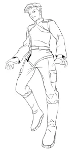
Yeah, this replaces the Service Dress. The frock coat goes back to being an outdoors-only type of coat, I bet.
Star Army
Star ArmyⓇ is a landmark of forum roleplaying. Opened in 2002, Star Army is like an internet clubhouse for people who love roleplaying, art, and worldbuilding. Anyone 18 or older may join for free. New members are welcome! Use the "Register" button below.
Note: This is a play-by-post RPG site. If you're looking for the tabletop miniatures wargame "5150: Star Army" instead, see Two Hour Wargames.
-
If you were supposed to get an email from the forum but didn't (e.g. to verify your account for registration), email Wes at [email protected] or talk to me on Discord for help. Sometimes the server hits our limit of emails we can send per hour.
-
Get in our Discord chat! Discord.gg/stararmy
You are using an out of date browser. It may not display this or other websites correctly.
You should upgrade or use an alternative browser.
You should upgrade or use an alternative browser.
Uniform Updates for the Star Army of Yamatai
- Thread starter Wes
- Start date
The black coat can still be used for ceremonies and is usable for cold weather, but the duty uniform (type 35) has returned to being the main uniform for formal events and also the chibi art. So while the black coat is still around, you will probably see it (and use it) less.
The duty uniform jacket is a jacket (in the sense of a BDU jacket...it's worn over a T-shirt) not a frock coat.
The duty uniform jacket is a jacket (in the sense of a BDU jacket...it's worn over a T-shirt) not a frock coat.
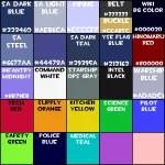
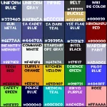
Here's an updated version. I made the science color darker and called the Star Army light blue gray "Uniform Gray."
The pink is the old SAINT panel color (prior to the introduction of gray and black panels). I might remove it if I find a color that needs to be on there more. Also, I'm a little iffy on the Kikyo purple. It's subject to change based on what I find in my archives.
Note that most of the panel colors are no longer "pure" colors, which I think makes them seem more realistic.
Attachments
Fred
Retired Staff
The Star Army's Hinomaru
In light of Wes making his newer Type 35 uniforms, I wanted to broach this.
With respect to Wes, because I know he did it himself some time ago... well, I'll be plain: I don't like the Hinomaru. I never really did. I just hate the thought of knowing that once I finish the ships I'm currently designing that I'll have to slap it on them.
While the site evolved visually, it hasn't aged well. I find the red rather tacky. The rendition of the Mindy is old enough to look crude today and I never identified much to its meaning. Not that I mean to offend, but I consider it an eyesore.
If Wes plans on investing more money in artwork, I'd propose that some serious thought be brought upon this element - the symbol of the Star Army - which sees such wide usage on other media.
Perhaps this would be worth discussing? I myself always liked the Yamataian 'Lily' better than the Star Army's 'Mindy on red sun'. Perhaps by the turn of YE 35 the Star Army could go towards something more elegant to symbolize its shift in ideology?
Symbology with judicious attention to detail while aiming for simplicity sounds like it might be a good direction to go; for example, I've always admired the Lotus Fleet logo that created the Lotus flower with clever shapes and then made it look futuristic.
For that matter, a friend of mine is amazing at making logos and could perhaps be called upon to design something nice. You can find examples of his past work on the each faction page of the previous forum RPG I was involved with.
I'd certainly be willing to look at suggestions for a new design. It could either be something that replaces the Mindy armor but keeps the hinomaru or a new emblem entirely. Any replacement design would have to be really good, as it will have to overcome ten years of tradition, making several hundred artworks obsolete. It will also need to be simple enough to make a patch out of.


