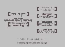
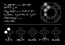
The idea is as much of it is based on components on a tic-tac-toe style grid. In the final, I want to be able to overlap elements of specific letters to form special sounds and accents, nesting letters inside other letters so it looks more like a symbol or logo - similar to how kanji starts from base characters and compounds them into complex ones to make common names and words.
I thought I'd give it a sort of arabic flare using ascenders and descenders (q, d, p, etc) but I explicitly wanted to avoid anything that could be confused with a serif, bracket, crossbars and overshoots with an emphasis instead on shoulders, eyes and tails with most of the typeface made from terminals - since these are the most recognisable characters and objects -- as you'll see from the red markers which indicate the 'iconic' components or letters which are most critically distinguished when speed-reading.

I also in the final want not to spell words with letters like we do but instead phonically with sounds.
For example, something like "extension" would become something like [eg][ste][ns][ion], composed only of four characters instead of nine.
I'm seriously debating reducing it down from the 26 or so characters I have down to about nine consonants and nine vowels and having the compounding/combination elements be what distinguish them --
similar to the system used in Korean which is a huge inspiration. I'm also debating having the difference between modern and orthodox Lorath being the addition of three new consonants.
I'm still unsure where I sit on glutteral stops (Haka'hn/Ey'tis/My'ean/Uiro'ka, etc, etc) or capital characters which I'm debating using an underline or dot for as an anchor point.
The idea of these negative-kerning compound characters though are what I'm really excited about.
I need to muck about with this some more and work out how to turn it into an actual font instead of just vector objects in Illustrator.
What kind of refrerences? I studied Arabic for two summers, so I might be able to help with a thing or two.
That would be awesome. I'm very curious about the construction of sounds, since like arabic (as far as I know anyway) Lor is very consonant heavy.
Some of that looks like Basic from Star Wars.
Yes, its the grid-pattern which establishes the 90 degree angles. Basic however also uses both circular curves and 90 degree brackets and as such isn't monospaced. The two are also quite easily confused which is why basic can be quite tricky to read.
Edit:
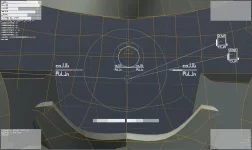
Does anyone know a good way of indicating the positions in three dimensions around an object without using a map in the conventional sense? The closest guide I can think of is the 3D waypoint indicator from
Ghost Recon Online
Do you think it'd make sense for a UI like this to also use sensor data to compile a 3rd person HUD too? How do you feel about that?
Edit:
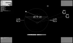
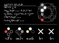
Mucking about with some ideas for team-mate and drone indicators. Each set of four dots represents a designated wing of units, complete with wing-callsigns. In addition, onboard drones are also represented similarly using the 'shell' assembly in the upper right. The inner shell's left and right sides are the drones on the left and right arms and the outer set, the legs, making sixteen total in this specific case. The gaps also mean the status of other linked hardware can also be shown.

The different states of the dots represent their current conditions... The white dots indicate a unit is manned - a gray dot that a unit is unmanned. Yellow dots indicate a unit has taken damage (with saturation indicating whether or not its a drone). A hollow dot indicates a unit has either departed or current condition is unknown. A red dot indicates a unit has been destroyed. A total absence of a dot indicates the wing was not fielded with full units. A ring indicates a CLASP formation (which in this specific example has a manned unit and a drone with two units missing in the second wing). A cross indicates a wing has been totally wiped out and an absence of a wing (just like an absence of dots) shows no wing was fielded under that designation.
These are used to indicate the units fielded, in this case, the Winter for the sake of posterity.

On the left, we have a terminal, showing current statuses, updates and events in the information datalink - for example, who is engaging what or decisions as they are made by any automatic units.
On the upper right, we have the shell indicator. This tells us about our drones or whatever hardware we're fitted with: The inner ring is the lower body and the outer body is the upper body. In this case, one Mercury drone on the upper left arm has been destroyed, one is currently fielded, two are fielded from the left leg and two are active (white/glowing).
Its a bit simple and it needs work, but its coming along nicely - the idea being you glance at the diagram. The idea is so pilots using the OS running will be able to describe how a character perceives information and their emotional reactions to it. At least, that's the idea, anyway. It also makes for good fluff, I guess.
Edit:

Live system indicator: While a 3D diagram is fine, it means the expected locations of information is constantly being shifted which would be counterintuitive since every time you look at your diagram, you'd need to find your bearings and point of relation to find new information.
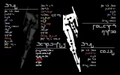
Instead, I've gone and listed every major system, alongside different categories. Colour dictates the status of a system (purple: Under repair. Yellow: stressed/overheating. Red: Shut-down).
The lines under the headings indicate which part links to which in terms of location and what the categories are: top right is arms, bottom right is legs, middle is torso and head and the left is system extensions and plugged in devices.
The diagram is also going to include the status of terminals (the doll like joints) and extensions (objects linked by terminals). Terminals are designed especially to separate, dislocating in a controlled way while ripping the structol substrate tendons and stretching the core fibre (like a stretchy wire running through the interior of all extensions, like the root of a plant in the ground or like the wire giving tension to a doll's joints). In theory, a limb could be purged and reattached at a different location, or even swapped in the heat of battle in this way.
As for the status of the exterior and physical construction of the machine, I'd rather that be more visceral, left up to physical sensation. Not necessarily what we'd consider pain but a divorced idea of it -- that you're 'aware' of the sensation but it doesn't limit your movement or reduce your willingness to do things, the same way you're still aware of severe pain on morphine but you don't let it get in the way. The only time it would ever become associated with the user is if for whatever reason it threatened the user (for example, cabin damage or attacks to critical systems) but even then it wouldn't be what we think of as the negative/avoidance association so much as a higher emphasis of pain.
Edit:

I'm still debating adding what would amount to progress-bars behind each text-element, indicating the total percentage either of performance or damage of the component but I worry it would visually over-complicate the diagram, ruining its usefulness - since the black contrast behind the text really helps the legibility enormously.

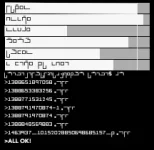
I'm also looking at other examples. Transmission, a torrent app for Mac OS X is particularly interesting.

The torrent information is broken up into the top bar (which is the available percentage of the file out there on the network) and the bottom bar (which indicates which chunks of the file you have in checksum order and which you'll need in order to complete the torrent). The density of information is much higher than a typical progress-bar, making use of its linear chronological nature. I'm wondering if some of these ideas can be applied elsewhere.
I think though, to indicate joint damage, I'm going to break each of the ball shaped units on the joints into a left and right half in my final which will be clearly separated in the high resolution version, in spite both being laid down on the left half -- implying visually that one set are the left as seen from the front and the other the left as seen from the rear, which would cover both sides quite nicely.
Also goddamn this is like the fourth time I've tried writing this post. I keep expecting APPLE + LEFT to justify-left like it does in Scrivener but in Chrome it takes you back a page. Fucking annoying seeing as I thought I had it mapped instead to the bracket keys.
Edit:
Do you like music?
I like music.


